FRONTEND MASTERS
Advanced SVG Animation 1
1
SVG Anatomy Overview
SVG!
- Crisp on any display
- Less HTTP requests to handle
- Easily scalable for responsive
- Small filesize if you design for performance
- Easy to animate
- Easy to make accessible
- Fun!

Look at all that green!
This pen.
-
Platonic Shapes
-
ViewBox
-
PreserveAspectRatio
-
Grouping
-
Drawing Paths
-
SVG on Export
Overview of the SVG DOM
Platonic Shapes
<svg xmlns="http://www.w3.org/2000/svg" viewBox="0 0 450 100">
 <rect x="10" y="5" width="90" height="90"/>
 <circle cx="170" cy="50" r="45" />
 <polygon points="279,5 294,35 328,40 303,62 309,94
279,79 248,94 254,62 230,39 263,35 "/>
 <line x1="410" y1="95" x2="440" y2="6" />
 <line x1="360" y1="6" x2="360" y2="95" />
</svg>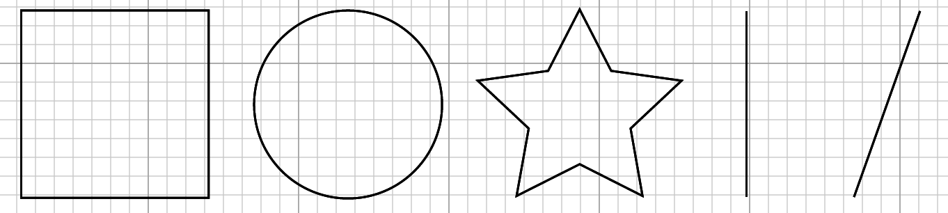
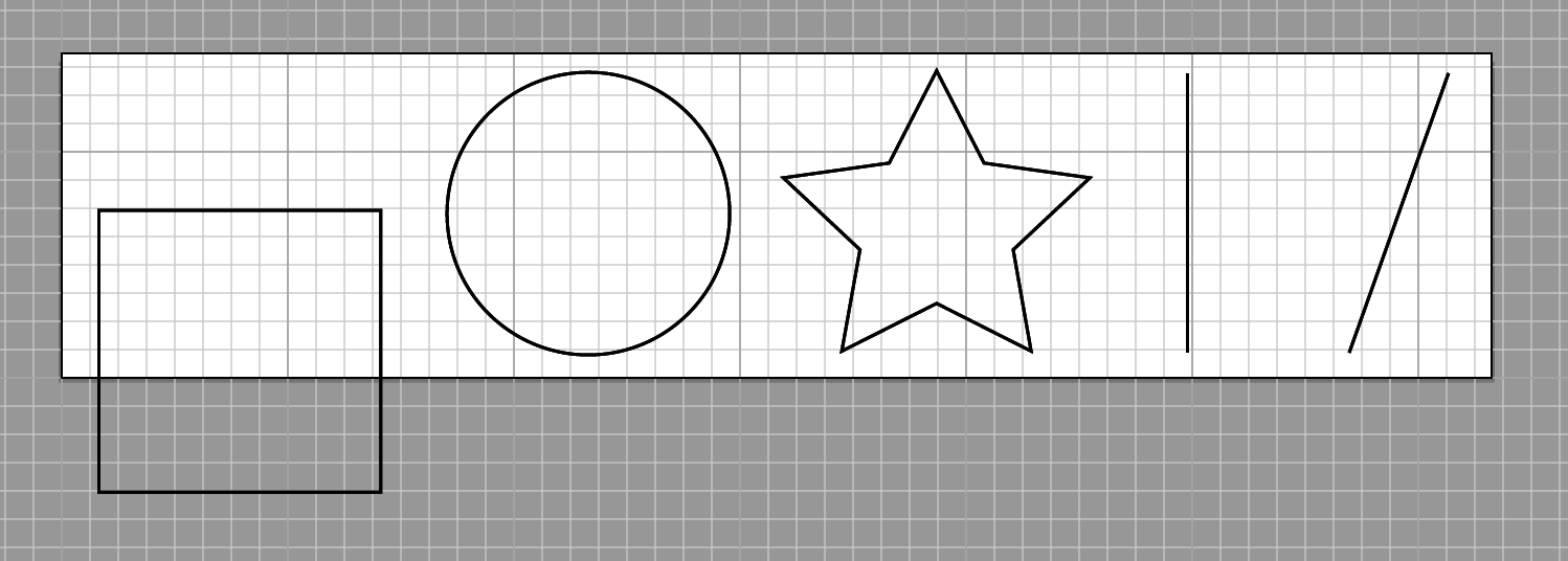
ViewBox and Responsive
<svg viewBox="0 0 450 100"></svg> svg { width: 450px; } <svg viewBox="0 0 450 100"></svg> svg { width: 250px; }ViewBox
PreserveAspectRatio
Default:
preserveAspectRatio=”xMidYMid meet”
uniformly scales, like background-size: cover; in CSS
Takes Three Parameters:
x____ Y____ ________
MinMid
Max
Meet
Slice
Align the _____ of the element's viewBox with
the _______ value of the viewport.
MinMid
Max
or none
well, two, technically:
<align> <meetOrSlice>
PreserveAspectRatio
Meet (default)
- entire viewBox is visible within viewport
- the viewbox is scaled up as much as possible, meeting other criteria
- viewBox < viewport
Slice
- entire viewport is covered by the viewBox
- the viewBox is scaled down as much as possible, meeting other criteria
- viewBox > viewport
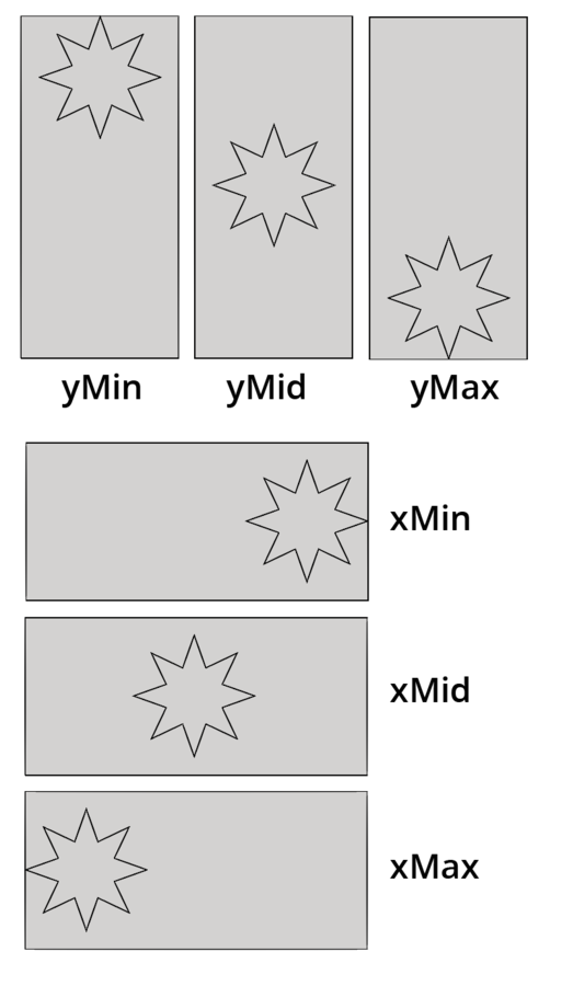
Meet
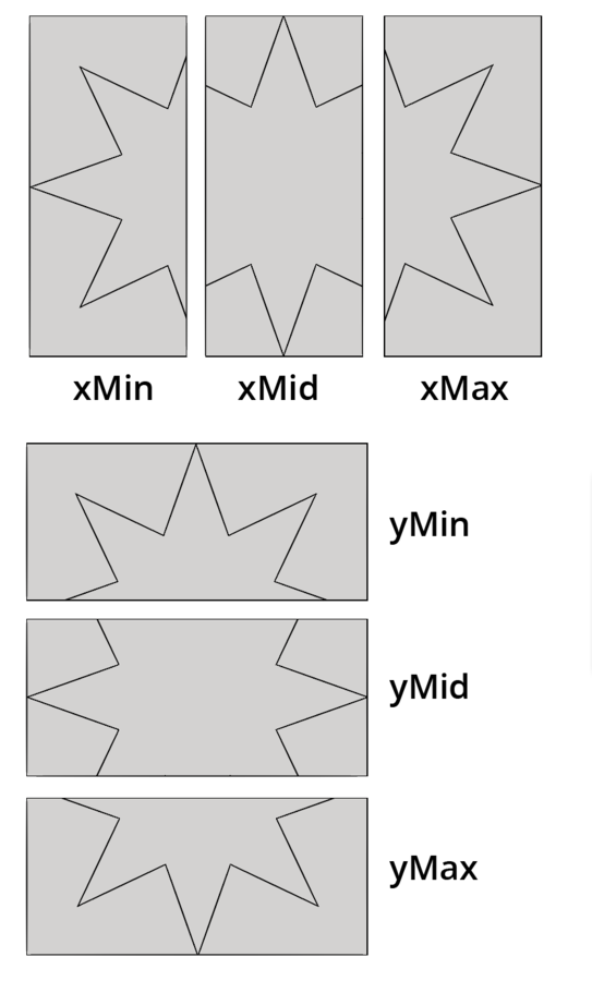
Slice
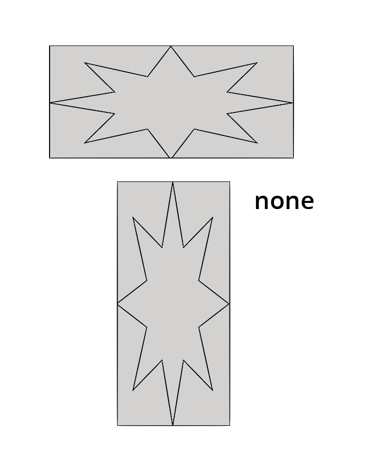
None
Further reading and credit:
SVG Essentials by Eisenberg and Bellamy-Royds
Paths and Groups
<svg viewBox="0 0 218.8 87.1">
  <g fill="none" stroke="#000">
    <path d="M7.3 75L25.9 6.8s58.4-6.4 33.5 13-41.1 32.8-11.2 30.8h15.9v5.5s42.6 18.8 0 20.6" />
    <path d="M133.1 58.2s12.7-69.2 24.4-47.5c0 0 4.1 8.6 9.5.9 0 0 5-10 10.4.9 0 0 12.2
32.6 13.6 43 0 0 39.8 5.4 15.8 15.4-13.2 5.5-53.8 13.1-77.4 5.9.1 0-51.9-15.4 3.7-18.6z" />
  </g>
</svg>
Group
<g fill="none" stroke="#000">
   ...
</g>
In animation: can add classes,
move multiple things at once
Polyline
<polyline points="14,17 136,37 77,117 230,87 132,158 172,158 "/>
Paths
<path d="M7.3 75L25.9 6.8s58.4-6.4 33.5 13-41.1 32.8-11.2
 30.8h15.9v5.5s42.6 18.8 0 20.6" />
<path d="M133.1 58.2s12.7-69.2 24.4-47.5c0 0 4.1 8.6 9.5.9
 0 0 5-10 10.4.9 0 0 12.2 32.6 13.6 43 0 0 39.8 5.4 15.8
 15.4-13.2 5.5-53.8 13.1-77.4 5.9.1 0-51.9-15.4 3.7-18.6z" />
Path Data

Paths: Curve Commands

2
Optimization, CSS Animation, + SVG DOM
Before Optimization
<?xml version="1.0" encoding="utf-8"?>
<!-- Generator: Adobe Illustrator 18.1.1, SVG Export Plug-In
 . SVG Version: 6.00 Build 0)  -->
<svg version="1.1" id="Layer_1" xmlns="http://www.w3.org/2000/svg"
xmlns:xlink="http://www.w3.org/1999/xlink" x="0px" y="0px"
	 width="218.8px" height="87.1px" viewBox="0 0 218.8 87.1"
enable-background="new 0 0 218.8 87.1" xml:space="preserve">
<g>
	<path fill="#FFFFFF" stroke="#000000" stroke-miterlimit="10"
d="M133.1,58.2c0,0,12.7-69.2,24.4-47.5c0,0,4.1,8.6,9.5,0.9
		c0,0,5-10,10.4,0.9c0,0,12.2,32.6,13.6,43c0,0,39.8,5.4,15.8,
15.4c-13.2,5.5-53.8,13.1-77.4,5.9C129.5,76.8,77.5,61.4,133.1,58.2z"
		/>
	<path fill="#FFFFFF" stroke="#000000" stroke-miterlimit="10"
d="M6.7,61.4c0,0-3.3-55.2,20.8-54.8s-7.2,18.1,4.1,29.9
		s8.6-31.2,32.1-15.8S86.7,41,77.2,61.8C70.4,76.8,76.8,79,37.9,
79c-0.4,0-0.9,0.1-1.3,0.1C9,81,40.1,58.7,40.1,58.7"/>
</g>
</svg>
<svg viewBox="0 0 218.8 87.1">
<g fill="none" stroke="#000">
<path d="M7.3 75L25.9 6.8s58.4-6.4 33.5 13-41.1 32.8-11.2 30.8h15.9v5.5s42.6 18.8 0 20.6" />
<path d="M133.1 58.2s12.7-69.2 24.4-47.5c0 0 4.1 8.6 9.5.9 0 0 5-10 10.4.9 0 0 12.2
32.6 13.6 43 0 0 39.8 5.4 15.8 15.4-13.2 5.5-53.8 13.1-77.4 5.9.1 0-51.9-15.4 3.7-18.6z" />
</g>
</svg>Same Output

After export, before implementation:
Optimize!
SVGs for Animation Support Breakdown
or, how I learned to love the Inline
For img src, object, embed, background url, and iframe, you can only designate animation if inside the SVG.
But for inline, both SVG animation and interaction are supported.
Animating with CSS, Refresher
@keyframes animation-name-you-pick {
   0% {
    background: blue;
    transform: translateX(0);
  }
   50% {
    background: purple;
    transform: translateX(50px);
  }
   100% {
    background: red;
    transform: translateX(100px);
  }
}
Keyframes
Animation Properties- Shorthand
.ball {
  animation: animation-name-you-pick 2s 2s 3 alternate ease-in-out forwards;
}
Animating with CSS, with a div
Result:
So, what happens when we apply that to the SVG?
Result:
Why?
- moving the whole SVG instead of the circle (not a problem here)
- background doesn't work for SVG, we use fill
- Apply the fill to the circle, not whole SVG
So, what happens when we apply it to the circle instead?
Result:
Why? Let's look at the code:
<svg width="70px" height="70px" viewBox="0 0 70 70">
  <circle class="ball2" fill="black" cx="45" cy="45" r="25"/>
</svg>
Better:
Target the circle, expand the viewBox,
use fill, and remove the fill from the markup.
<svg width="200px" height="70px" viewBox="0 0 200 70">
  <circle class="ball3" cx="45" cy="45" r="25"/>
</svg>
@keyframes second-animation {
0% {
fill: blue;
transform: translateX(0);
}
50% {
fill: purple;
transform: translateX(50px);
}
100% {
fill: red;
transform: translateX(100px);
}
}Better:
Target the circle, expand the viewBox,
use fill, and remove the fill from the markup.
Result:
So, why SVG?
Let's look at the star code again:
<polygon fill="white" stroke="black" points="279,5 294,35 328,40 303,62
309,94 279,79 248,94 254,62 230,39 263,35 "/>
CSS was not made for drawing like SVG is.
I drew this in SVG and it's 2kb gzipped.
We can also reach inside it and animated isolated elements. (And we will!)
Exercise 1:
Make a simple SVG with 4+ attributes, optimize it, and animate at least two elements.
- Illustrator
- Sketch
- Inkscape
- Draw SVG
3
SVG Sprites, Performance and Planning
SVG Sprites
Start with this technique from Joe Harrison

Sprite Technique #1:
Splash with Step()
Step Animation
Of all web-based animation techniques, step animation most closely resembles old hand-drawn cel animation.
Let's use this to our advantage.


3 of 21 frames.
Shooting on twos.
This pen.
Large Sprite and animate the background position.
Keep it simple.
@keyframes splashit {
        100% { background-position: 0 -3046px; }
}

.splash {
  background: url(‘splash-sprite2.svg’);
  animation: splashit 1.8s steps(21) infinite;
}

/* fallback */
.no-svg .splash {
  background: url(‘splash-sprite2.png’);
}
Fallbacks
2 ways to make this.
Illustrator, with a template:
- Object → Path → Split Into Grid
- View → Guides → Make Guides
- Draw and then copy paste and align, change drawing slightly
- Can also easily export png fallback
Works with Sketch, too.
2 ways to make this.
In an SVG editor with Grunticon
- Draw drawing in SVG editor, save off one by one
- Can also draw on paper and scan
- Use grunticon
- It makes the fallback for you
Sprite Technique #2:
Rolling Sprite Background
without Step()
Take the steps() out
The background rolls through...
Let's use this to our advantage.


/*--extend--*/
.area {
  width: 600px;
  height: 348px;
}

.fore, .mid, .bk, .container { @extend .area; }
Extend to keep it DRY
.fore {
  background: url(‘fore.svg’);
  animation: bk 7s -5s linear infinite;
}

.mid {
  background: url(‘mid.svg’);
  animation: bk 15s -5s linear infinite;
}

.bk {
  background: url(‘bkwalk2.svg’);
  animation: bk 20s -5s linear infinite;
}

@keyframes bk {
  100% { background-position: 200% 0; }
}
Z-index for parallax, consistent bk position,
different length of animation in seconds.
Sprite Technique #3:
Modern Day Book of Kels
Illustration with SVG Sprite
Make it a responsive svg animation sprite


This pen.
That whole SVG and animation was
8KB Gzipped.
Compare to using text with photos to illustrate an article.
CSS Animation
[class^="star"] {
  animation: blink 2s ease-in-out infinite both;
}

[class^="dot"] {
  animation: blink 5s -3s ease-in-out infinite both;
}

@keyframes blink {
  50% { opacity: 0; }
}
No width and height for the SVG itself, instead define it in css
.initial {
  width: 50%;
  float: left;
  margin: 0 7% 0 0;
}
We're using percentage here, but we could also use flexbox.
viewBox="0 0 490 474" preserveAspectRatio="xMidYMid meet"Define smaller viewbox, put in preserveAspectRatio (though this is also the default)
Animation MEDIA QUERIES
+ Adjust initial object, affects animation
[class^="mountain"], [class^="grass"] {
  transform: skew(1.5deg);
}

@media screen and ( min-width: 500px ) {
  [class^="mountain"], [class^="grass"] {
      transform: skew(2deg);
  }
}
!important part
Animation MEDIA QUERIES
You can do this, you know this already, it applies to all animation, even javascript
!important part
Viewbox shift with JavaScript
var shape = document.getElementById("svg");

// media query event handler
if (matchMedia) {
        var mq = window.matchMedia("(min-width: 500px)");
        mq.addListener(WidthChange);
        WidthChange(mq);
}
// media query change
function WidthChange(mq) {
        if (mq.matches) {
            shape.setAttribute("viewBox", "0 0 490 474");
        }
        else {
            shape.setAttribute("viewBox", "0 490 500 500");
        }
};
Acts like a window to show and hide the requisite parts of the sprite
Sprite Technique #4:
Responsive Design for an
Animated Infographic
Pretty close to Technique #3,
Kels Illustration
Revisiting old approaches
Responsive Animated Infographic

Three sources with detailed analysis showing lead improvements
Conversion
(one source example, The Whole Brain Group)
- increased traffic to their website by over 400%
- lead increase by almost 4500%
- the number of new visitors to their site to almost 78%
Problems
- Not responsive- tipping point: Tim Kadlec
- Not updated to current context
- ^ Especially design
All posts older than 2 years.
What Happened?
This pen.
Responsive:
Change the viewbox in JavaScript like we did before:

Responsive:
Media queries for layout, and fallback with Modernizr:
/* media query example element, mobile first */
@media (max-width: 825px) {
  .container {
    width: 100%;
  }
}
@media (min-width: 826px) {
  .container {
    width: 825px;
  }
}

/* fallback */
.inlinesvg .fallback {
  display: none;
}

.no-inlinesvg .fallback {
  width: 500px;
  height: 500px;
  display: block;
}
Accessibility
Title and associative aria tags: (WIP)
<svg aria-labelledby="title" id="svg"
  xmlns="http://www.w3.org/2000/svg"
  viewBox="0 0 765 587">
<title id="title" lang="en">Circle of icons
  that illustrate Global Warming Solutions
</title>
You can also add a title for elements in the SVG DOM
This resource, with support charts.
Also, this article by Dudley Storey.
Atmospheric and Elemental Motion
Elemental Motion
- Further away is less contrast, blurry
- Does the air or environment effect movement
- Reducing precision allows for understanding
- Combine techniques


Sprite and Elemental Motion
//mid and mid-sm are the same
#back {
    opacity: 0.8;
    animation: bkmove 70s linear infinite;
    animation-iteration-count: 3;
}

#teal {
 animation: hover 2s ease-in-out infinite both;
}

#tshadow {
  animation: shadowhover 2s ease-in-out infinite both;
  transform-origin: 50% 50%;
}

#purple {
 animation: hover 2s -0.5s ease-in-out infinite both;
}
//same shadow
#heart {
    animation: heartpop 2s 1.25s ease-out both;
    transform-origin: 50% 50%;
    transform: scale(0);
    -moz-transform: scale(1); //firefox transform-origin svg bug hack
}

/*had to split the heart animation in two due to a bad safari
svg bug that doesn't allow for opacity and transform*/
#heartopacity {
    animation: heartopacity 1.5s 1s ease-out both;
    opacity: 0;
}

#floaty {
  opacity: 0.2;
  animation: floataround 3s ease-in-out infinite both;
  transform-origin: 50% 50%;
  animation-iteration-count: 30;
}
@keyframes bkmove {
100% {
transform: translateX(-1600px);
}
}
@keyframes heartopacity {
50% {
opacity: 0.9;
}
90% {
opacity: 0.2;
}
100% {
opacity: 0;
}
}
@keyframes heartpop {
50% {
transform: scale(1);
-moz-transform: scale(1);
}
90% {
transform: scale(1.5);
-moz-transform: scale(1);
}
100% {
transform: scale(0);
-moz-transform: scale(1);
}
}Exercise 2:
Use one of the 5 techniques to make an SVG sprite and animate it with CSS
Starter SVG here, if you need it:
Frontend Masters 1: Advanced SVG Animation
By sdrasner
Frontend Masters 1: Advanced SVG Animation
SVG Anatomy, CSS Animation, SVG Sprites


