Datavisualisatie
30 november &
1 december 2020
@maartenzam
Statbel
valkuilen, BASISREGELS en tools
Programma
1. Datavisualisatie: introductie
2. Valkuilen in datavisualisatie
3. Oefening: de Datavisualisatie Checklist
4. Grafiektypes en "chart choosers"
5. Voorbij staven en lijnen
Maarten Lambrechts?
Datavisualisatie: introductie
I
Waarom datavisualisatie?
"As knowledge increases amongst mankind, and transactions multiply, it becomes more and more desirable to abbreviate and facilitate the modes of conveying information from one person to another, and from one individual to the many."
William Playfair, 1786
"Everything that can be expressed in numbers can be represented by lines."
John Playfair
| Year | Imports | Exports |
|---|---|---|
| 1700 | 71,1 | 32,8 |
| 1705 | 74,5 | 40,9 |
| 1710 | 82,6 | 59 |
| 1715 | 87,2 | 77,9 |
| 1720 | 96,8 | 75,2 |
| 1725 | 102,6 | 71,3 |
| 1730 | 96,4 | 64,7 |
| 1735 | 93,7 | 60,5 |
| 1740 | 92,9 | 65,1 |
| 1745 | 92,5 | 74,3 |
| 1750 | 90,1 | 77,4 |
| 1755 | 79,9 | 82,8 |
| 1760 | 76,6 | 117,5 |
| 1765 | 79,6 | 151,8 |
| 1770 | 83,8 | 163,8 |
| 1775 | 90,4 | 175,7 |
| 1780 | 92,7 | 185,4 |


"Explanatory" datavisualisatie
"Exploratory" datavisualisatie
Het geheim
De vroege waarneming
Preattentive processing
868888609462834719714449648
122286651978794222484779908
939340243123007392183390116
351684124962334339709749742 868888609462834719714449648
122286651978794222484779908
939340243123007392183390116
351684124962334339709749742


Valkuilen in datavisualisatie
II


2. Knip geen staven


3. Knip geen tijdsassen


4. Label direct


5. Gebruik kleuren bewust


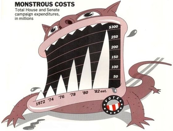
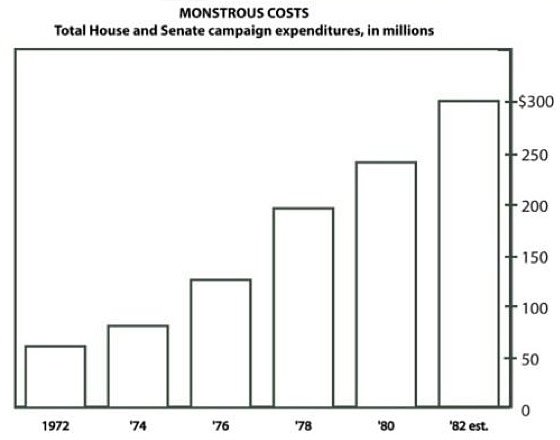

6. Vermijd chart junk


7. Schaal de oppervlakte van cirkels, niet de straal


8. Vertel het verhaal


9. Geen dubbele assen

10. Correlatie is geen causaliteit


11. Doe geen 3D
Behalve als je de New York Times bent

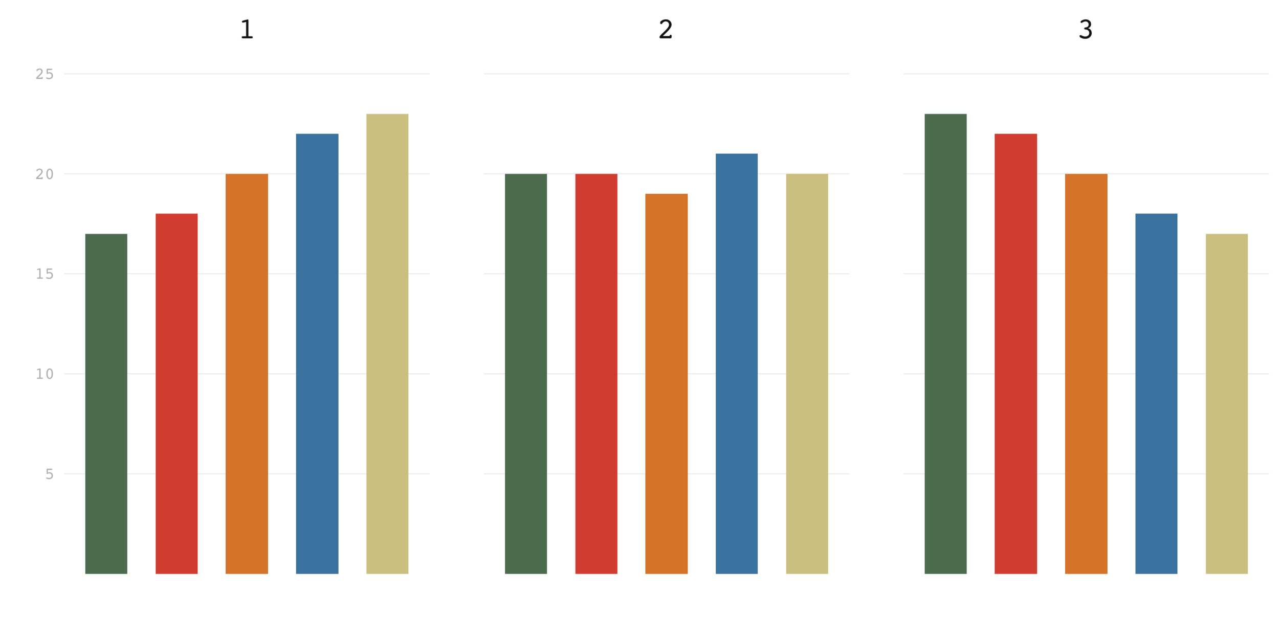
12. Sorteer op de data


13. #Endrainbow
Kleuren: tools


14. Gebruik relatieve cijfers op kaarten (per capita, ...)


15. Soms is de beste kaart geen kaart


16. Alle kaarten liegen
Oefening: de Datavisualization Checklist
III


Grafiektypes & "Chart choosers"
IV
chartType=f(dataTypes,
chartType = f(dataTypes,
dataSize,
dataSize,
message,
message,
audience)
audience)


Chart choosers


Tool chooser

Voorbij staven en lijnen
V
Creatief met punten

Dot plot
Alternatief voor gegroepeerde staven

Dot plot
Datadichtheid kan hoog zijn


Creatief met staven
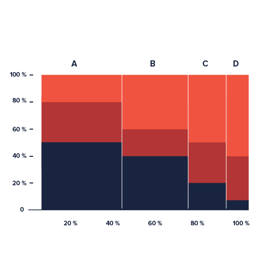
Marimekko
Creatief met tijd

Slope chart
Vergelijk 2 momenten in de tijd

Slope chart
Vergelijk 2 momenten in de tijd

Slope chart
Vergelijk 2 momenten in de tijd

Horizon chart
Tijdreeksen met een hoge datadensiteit

Horizon chart
Tijdreeksen met een hoge datadensiteit

Horizon chart
Tijdreeksen met een hoge datadensiteit

Connected scatter plot
Trends in 2 dimensies over tijd

Connected scatter plot
Hierarchie

Waterfall chart
Cumulatief effect van componenten


Dank!
slides.com/maartenzam/statbel-nl
slides.com/maartenzam/statbel-fr
www.maartenlambrechts.COM
@maartenzam
Datavisualisatie 30 november & 1 december 2020 @maartenzam Statbel valkuilen, BASISREGELS en tools
Datavisualisatie Statbel
By maartenzam
Datavisualisatie Statbel
- 4,219


