Data Visualisation
Brussels
20 February 2020
@maartenzam
DG EAC
Pitfalls, guidelines & journalistic techniques
On the menu
Intro to data visualisation: history and psychology
16 pitfalls in data visualisation
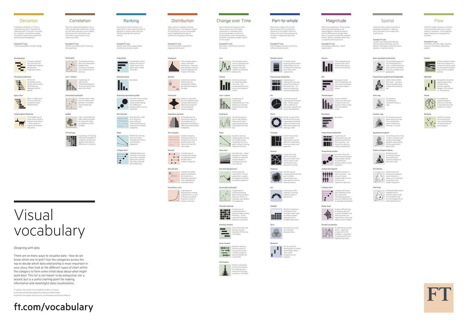
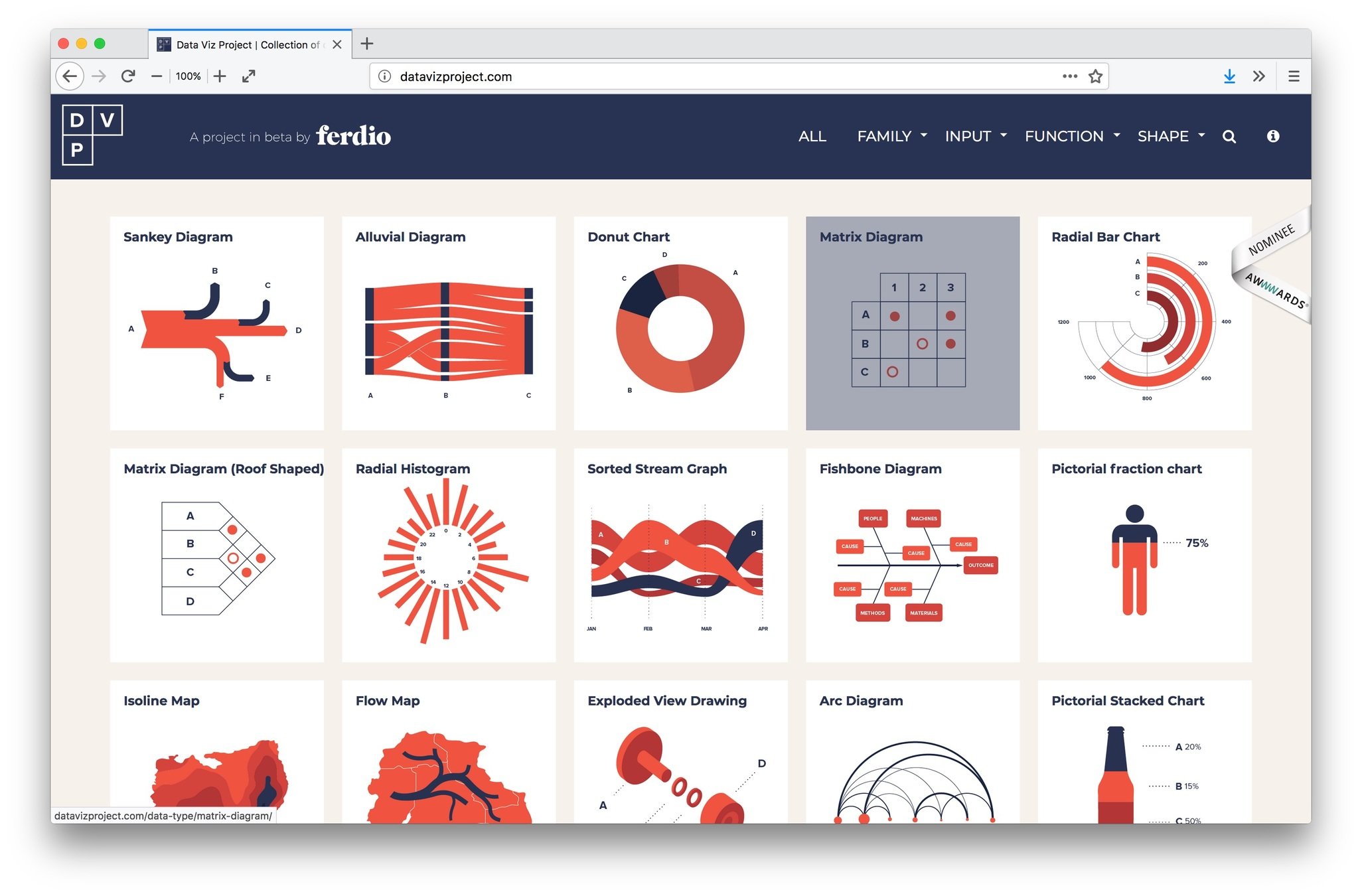
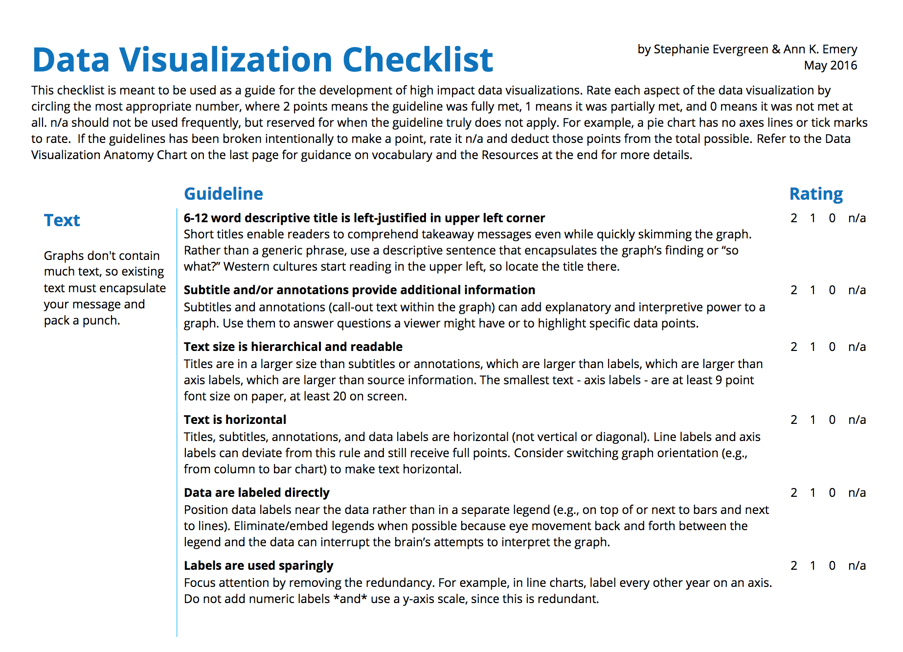
The Data visualisation Checklist
Journalistic techniques
Maarten Lambrechts?
Why visualisation?
| Party | Oct 2010 | Sep 2012 | May 2013 | Oct 2013 |
|---|---|---|---|---|
| N-VA | 28,2 | 36,3 | 32,1 | 27,9 |
| CD&V | 17,6 | 18,5 | 17,4 | 19 |
| SP.A | 14,9 | 14,5 | 14,7 | 13,4 |
| VB | 12,6 | 9,5 | 10,6 | 10,6 |
| VLD | 14 | 10,7 | 10,1 | 13,8 |
| Groen | 7,1 | 7,9 | 9,5 | 10 |
| LDD | 3,7 | 1,3 | 0,4 | 1,3 |
| PVDA | 5 | 5 | 2,5 | 3,9 |
| Andere | 2 | 1,2 | 2,6 | 0,1 |


Explanatory data visualisation
Exploratory data visualisation
The secret
Preattentative processing
868888609462834719714449648
122286651978794222484779908
939340243123007392183390116
351684124962334339709749742
            868888609462834719714449648
122286651978794222484779908
939340243123007392183390116
351684124962334339709749742


16 datavisualisation pitfalls


Chart choosers


2. Don't cut bars


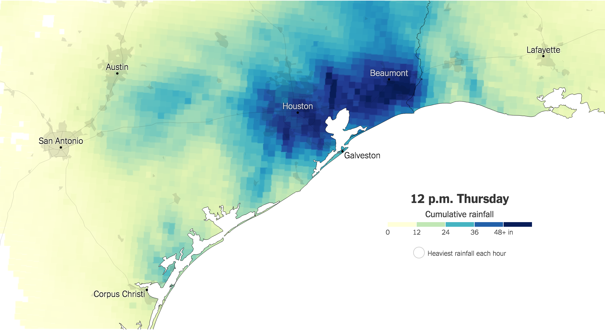
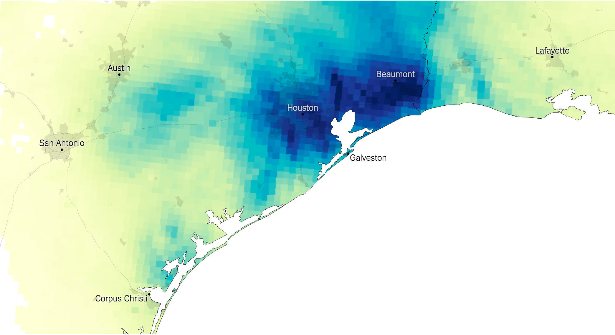
3. Don't cut time axes


4. Label directly


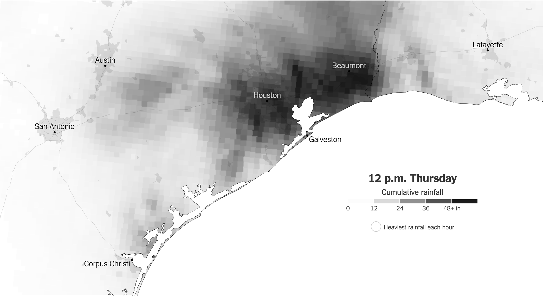
5. Use colors deliberately...
... and consistently


7. Avoid chart junk


8. Scale circles by area


9. Tell the story


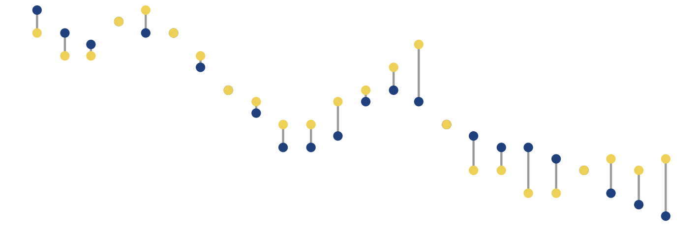
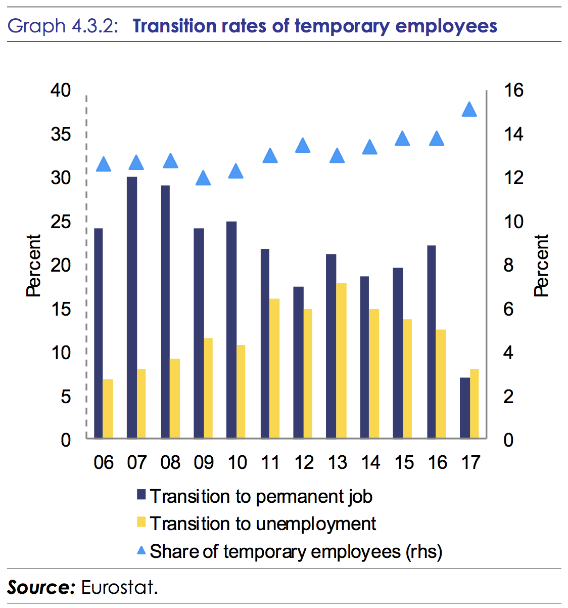
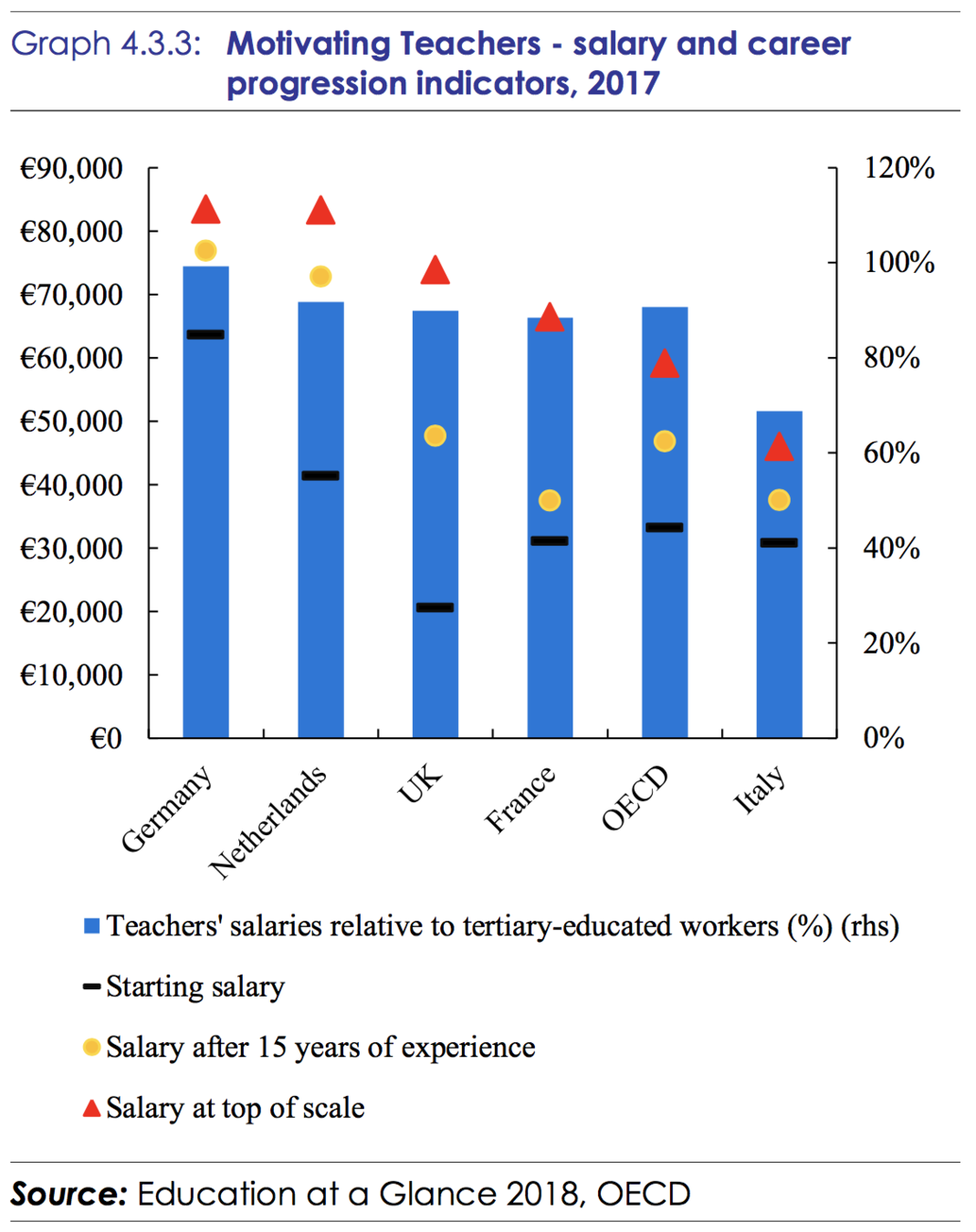
10. Double the axes, double the mischief

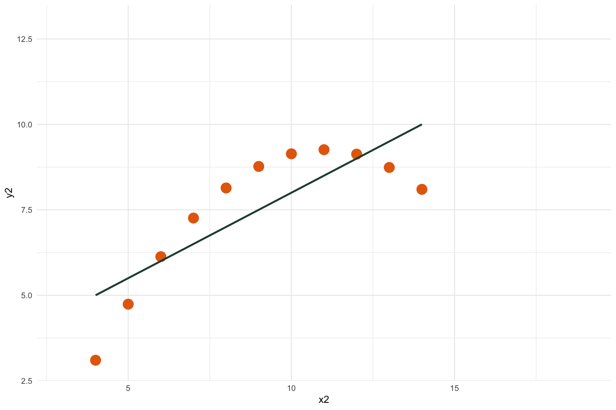
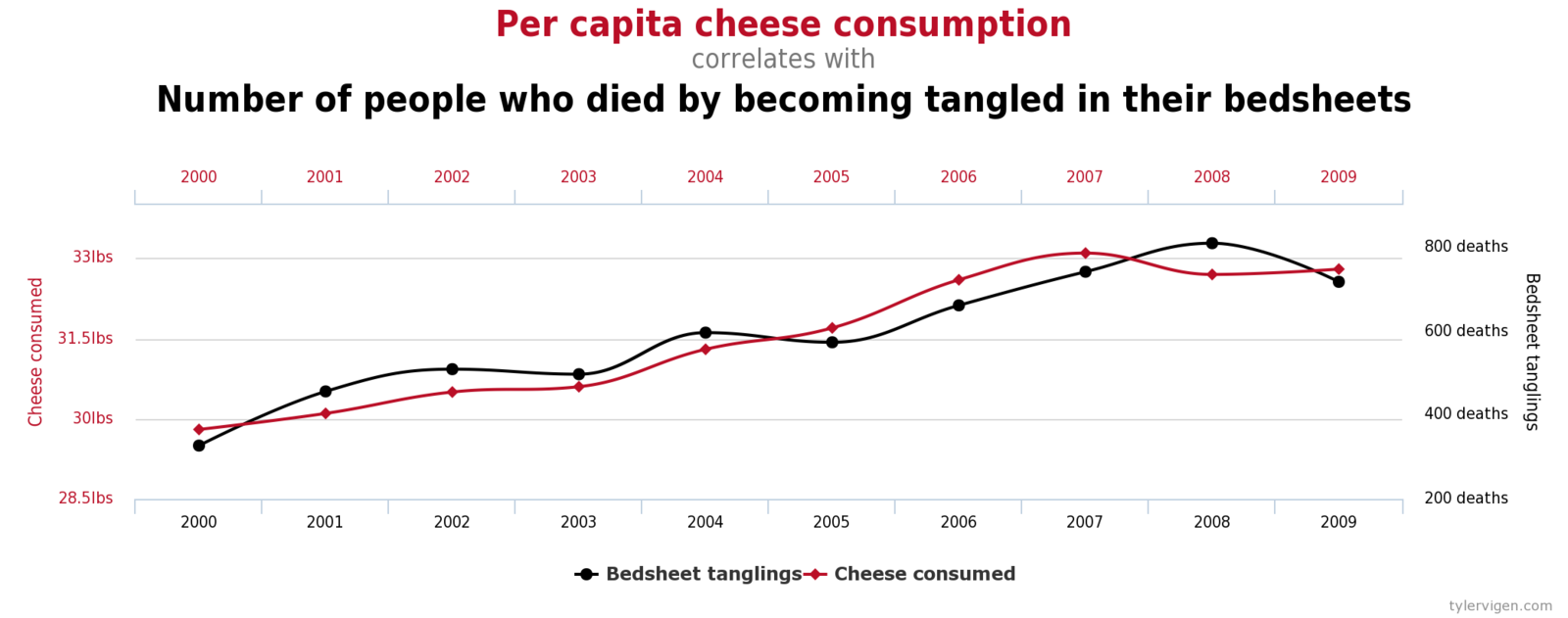
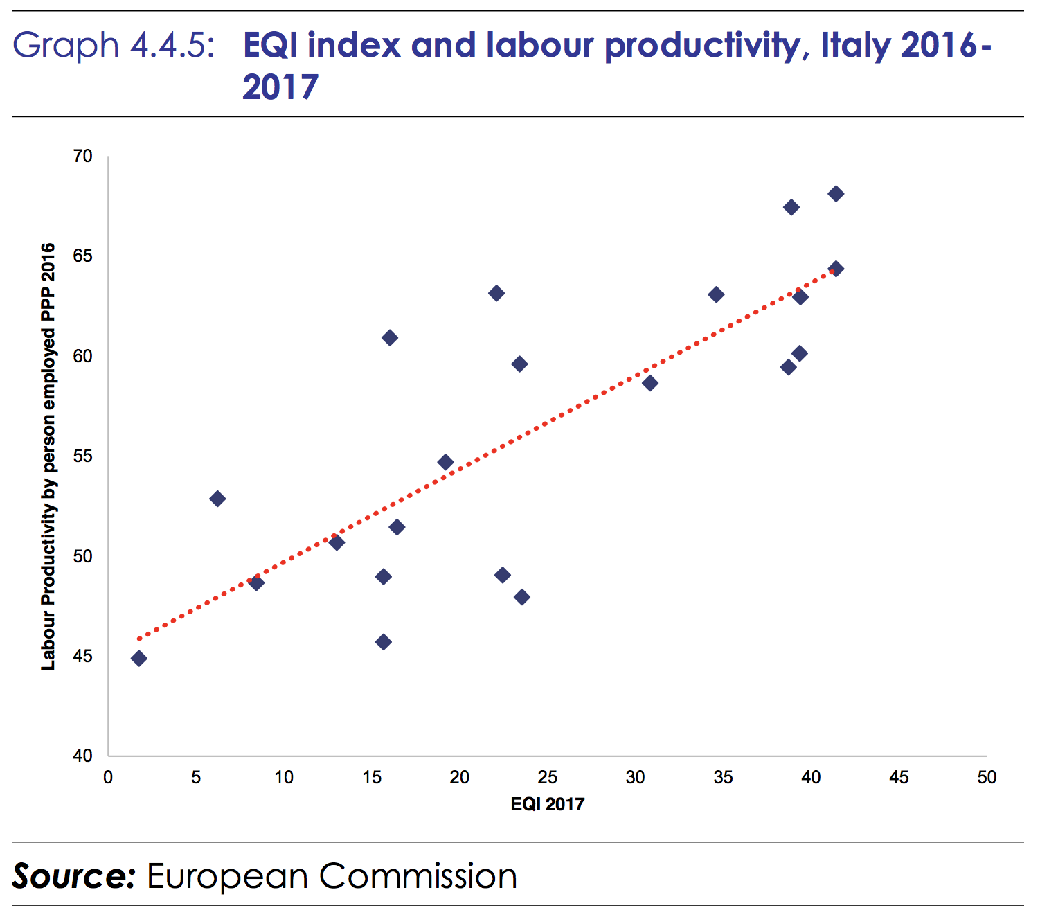
11. Correlation is not causality


12. Don't do 3D
Unless you are the New York Times
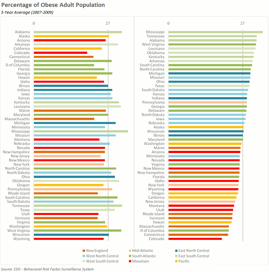
13. Sort on the data


14. Scale numbers on maps


15. Sometimes the best map is no map


16. All maps lie
Introducing:
de Datavisualization Checklist
Journalistic techniques in data communication
5W, 1H
Where?
When?
Who?
What?
Why?
How?
Context
Context
Character
Cause and effect
Sensemaking
The inverted pyramid
The News
important details
BackgrouND
Journalistic reality
Fixed length
Breaking news comes in
'When in doubt, leave things out'
'Cut from the bottom'
Make it personal
Address the reader
Put the "you" in the headline
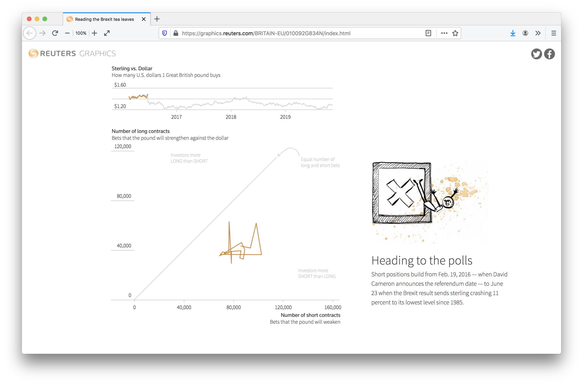
Storytelling with charts
"You have to be like the worst tabloid newspaper in the front and the Academy of Science in the back."
Hans Rosling


"The annotation layer is the most important thing we do. Otherwise it's a case of here it is, you go figure it out."
Amanda Cox, The New York Times


1 chart,
1 message
Data story patterns
Intersections

Outliers
Components
Repetition

Gradual visual reveal


Thank you!
Visualisation | DG EAC
By maartenzam


