FlexBox CSS Magic
One Rule to Rule them all
what is it?
The Flexbox Layout provides an efficient way to layout, align and distribute space among items.
A flex container expands items to fill available free space, or shrinks them to prevent overflow.
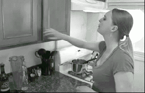
OH NO.
I still haven't Figured Out your
ANOTHER LAYOUT system?
display:inline-table-cell
VOODO!
Previous
the problem today:
With the growing demand to responsive, dynamic elements and complex designs, current methods are no longer cutting it.
floats, table-cell, text-align, margin:auto, vertical-align....
CSS is broken
centering nightmare
centering nightmare

Flexible components
justified headers

pinned at the bottom
dynamic length lists

holy grail layout
Still don't want flexbox?

Flexbox solves:
1. Items distribution

2. Items size
3. Items order
Basics
Flex Container
Flex Items
Main Axis
Cross Axis
so simple now:
Quick centering
Equal distribution
.container {
  display: flex;
  justify-content: center;
  align-items: center;
}
.container {
display: flex;
}
input {
flex: 1;
}So simple!

Flex container
.container {
    display: flex;
}
The container controls the distribution and flow
of its children.
When setting an element as a flex container, it automatically sets its children as flex items.
Flex container - props
justify-content How the items are aligned horizontally
align-items How the items are aligned vertically
flex-direction Which direction the items are flowing
flex-wrap Should the items wrap to more than one line
align-content If wrapped - alignment of wrapped lines
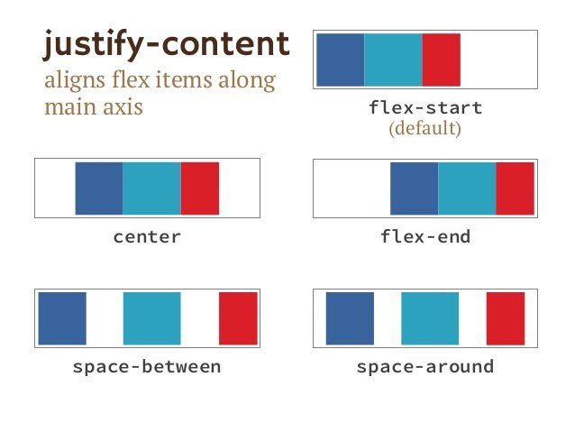
Flex container - justify
.container {
    display: flex;
    justify-content: center;
}
Use justify-content to sort the items along the main axis.
.container {
display: flex;
justify-content: space-between;
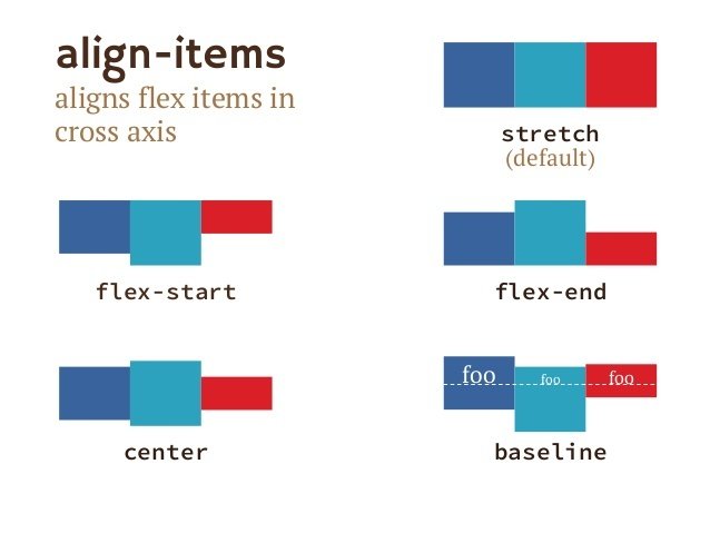
}Flex container - ALIGN
.container {
    align-items: flex-start;
}
Use align-items to sort the items along the cross axis.
.container {
    align-items: center;
}
.container {
align-items: stretch;
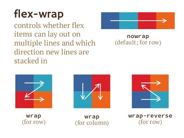
}flex container - flow
.container {
    flex-wrap: wrap;
}
Use flex-wrap to determine how items wrap to next line.
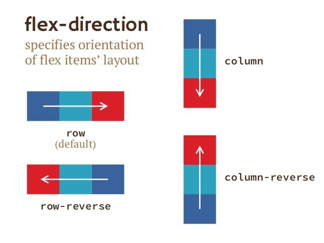
.container {
    flex-direction: column;
}
.container {
flex-direction: column;
align-items: center;
}Use flex-direction to set row, column, or reversed order.
CONTAINER - SUMMARY
container - playground
Flex items
.antman {
    width: 35px;
}
.spiderman {
    flex: 1;
}
.the-hulk {
    flex: 3;
}
Each item controls its own size and order, and in some cases defines its location.
Flex item - props
flex How the item will grow/shrink when there is free space
align-self How this specific item will be aligned
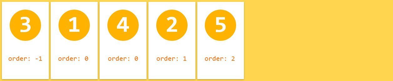
order What will be the order of this item within the children
margin When auto - takes up all free space
flex item - props
align-self - Aligns the item itself, regardless of container
margin - When set to "auto" - it pins the element to one of the sides.
order - Determines the order of the element
.item:nth-child(3) {
  order: -1;
}
.item:nth-child(4) {
align-self: flex-end;
}
Flex items - flex
.flex-item {
    flex: <flex-grow> <flex-shrink> <flex-basis>;
}
This is where flexbox gets flexible.
The flex container sums the sizes of all its children.
If any extra space is left, it is distributed between them according to flex-grow, flex-shrink and flex-basis.
flex-grow
how much the item will grow, relative to other items, if space is available
(default: 0)
flex-shrink
how much the item will shrink, relative to other items, if there is not enough space
(default: 1)
flex-basis
the initial starting size before space is distributed
(default: auto)
.flex-item {
    flex: 1 0 10px;
}
This means the item will start as 10px, cannot be shrinked, and it will get 1 unit of extra space, if left.
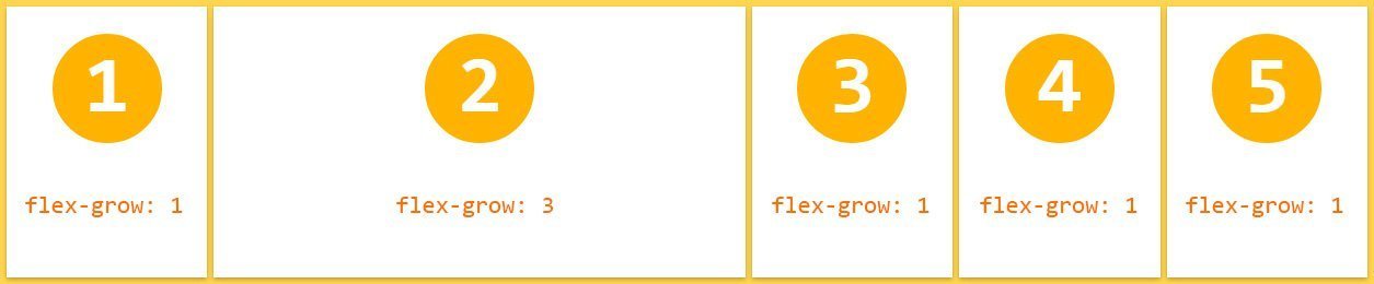
Flex-grow
How much the flex item will grow relative to the rest of the flex items, when positive free space is distributed.
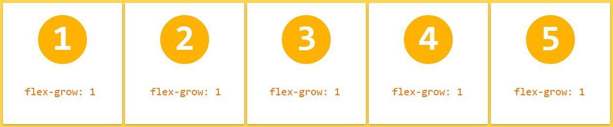

.item {
    flex-grow: 1;
}
.item {
flex-grow: 1;
}
.item-2 {
flex-grow: 3;
}Flex-shrink
How much the flex item will shrink relative to the rest of the flex items, when negative free space is distributed.
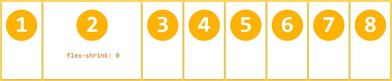
.item {
    flex-shrink: 1;
}

.item-2 {
    flex-shrink: 0;
}
Initial size of the item, before all space calculations.
This is sort of "min-width". the browser will only go beneath it if there is no other option (no wrap, for example)
Flex-basis
the Flex shorthand
The W3C recommends always using the flex shorthand when possible. It can set other values correctly.
.item {
  flex: 2;
}
.item {
flex: 2 1 0%;
}.item {
flex: 0 1 auto;
}.item {
/* no value */
}the Flex cheatsheet
I want my item to be fully flexible
I want my item to start at a size,
never grow, and shrink only if needed
I want my item to start at a size, grow freely, and shrink if needed
.item {
   flex: 1;
/* flex: 1 1 0%; */
}
.item {
width: 50px;
/* flex: 0 1 auto; */
}.item {
flex: 50px;
/* flex: 1 1 50px; */
}I want my item to be in a specific size!
Leave me out of this.
.item {
  width: 50px;
  flex: none;
}
the Flex shorthand
Example - flex by factor (flex-grow)
.item {
   flex: 1;
// flex: 1 1 0px;
}

.item:hover {
   flex: 2;
// flex: 2 1 0px;
}
the Flex shorthand
Example - flex by size
.container {
   flex-wrap: wrap;
}

.item {
   flex: 30%;
// flex: 1 1 30%;
}

.item:hover {
   flex: 100%;
// flex: 1 1 100%;
}
Flex playground
Let's build a responsive component!
Common cases
1. Quick centering
.container {
  display: flex;
  justify-content: center;
  align-items: center;
}
2. Proportional distribution
.container {
  display: flex;
}
.item {
  flex: 1;
}

Common cases
3. Even spacing
4. Centered wrapping
.container {
  display: flex;
  flex-wrap: wrap;
  justify-content: center;
  align-content: center;
}
.container {
display: flex;
justify-content: space-between;
align-items: center;
}
Common cases
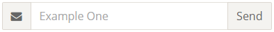
5. Decorated input
.wrapper{
  display: flex;
}
.input {
  /* Grow as needed, but never shrink so
     small that we can't read the placeholder */
  flex: 1 0 8em;
}
.submit {
  /* Never shrink or grow */
  flex: 0 0 auto;
}
.icon {
  /* Don't shrink or grow and use a default size */
  flex: 0 0 2.75em;
}
Common cases
6. Dynamic component
.container {
  display: flex;
  align-items: stretch;
}
.left {
  width: 50px;
  display: flex;
  flex-direction: column;
  justify-content: space-around;
}
.right {
  flex: 1;
}
Common cases
7. Pinned item
.container {
  display: flex;
  justify-content: space-around;
  align-items: stretch;
}
.column {
  display: flex;
  flex-direction: column;
}
.item:last-child {
  margin-top: auto;
}
Common cases
8. Form layout
.container {
display: flex;
align-items: stretch;
}
.column {
flex: 1;
display: flex;
flex-direction: column;
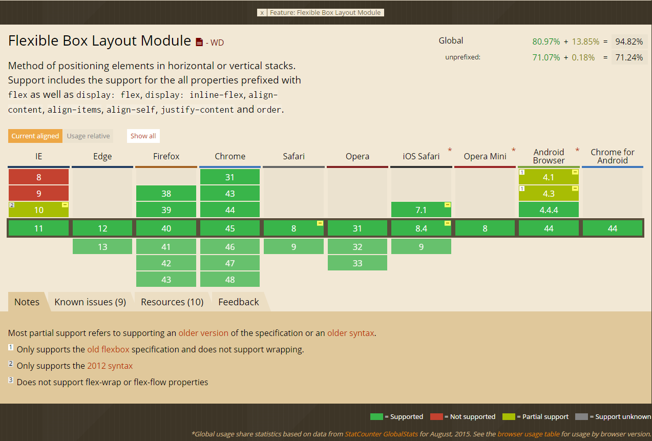
}Browser support
CANIUSE
autoprefixer
RESOURCES
- The Bible - CSS Tricks
https://css-tricks.com/snippets/css/a-guide-to-flexbox/
- Good Visual Guide
https://scotch.io/tutorials/a-visual-guide-to-css3-flexbox-properties
-
Different use cases
https://philipwalton.github.io/solved-by-flexbox/
- List of tutorials
http://zomigi.com/blog/rwd-flexbox/
playgrounds
- Flexbox in 5 minutes
http://flexboxin5.com/
- Flexbox please
http://demo.agektmr.com/flexbox/
-
Visual playground
https://scotch.io/demos/visual-guide-to-css3-flexbox-flexbox-playground
- Flexyboxes
http://the-echoplex.net/flexyboxes
- Good old Inspect Element
That's all folks!

Liad Yosef @ Duda
ADvanced
Flex-basis problem
The remaining space is calculated according the all the flex-basis values of the children. When you need perfect proportion - use the flex shorthand or make sure it is 0.
.item {
    flex-grow: 1;
    flex-basis: 0;
}

.item-3 {
    flex-grow: 2;
}
flex-grow: 1
flex-grow: 1
flex-grow: 2
.item {
    flex-grow: 1;
    flex-basis: 10px;
}

.item-3 {
    flex-grow: 2;
}
No basis - perfect proportion
With basis - unexpected result
flex-grow: 1
flex-grow: 1
flex-grow: 2
10px+ 5px=15px
10px+ 5px=15px
10px+10px=20px
if 50px available
the Flex shorthand
The W3C recommends always using the flex shorthand when possible. It can set other values correctly.
.item {
  flex: 2;
}
.item {
flex: 2 1 0%;
}.item {
flex: 30px;
}.item {
flex: 1 1 30px;
}.item {
flex: none;
}.item {
flex: 0 0 auto;
}.item {
flex: 0 1 auto;
}.item {
/* no value */
}Flexbox
By Liad Yosef


