Responsive grids

Freddy Montes
-
Diseñador Gráfico
- UI developer
- HTML & CSS
- SASS & Compass
@fmontes
Que es un grid?
"a series of intersecting horizontal and vertical lines spaced at regular intervals"
http://www.smashingmagazine.com/2010/04/29/grid-based-web-design-simplified/
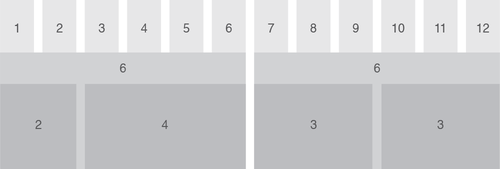
partes de un grid

Responsive design?
"The practice consists of a mix of flexible grids and layouts, images and an intelligent use of CSS media queries."
SASS
Reglas anidadas, variables, mixins, herencia de
selectores y más.
Compass
Es un framework para Sass, diseñado para hacer
el trabajo de estilos más fácil y eficiente.
Mobile first
Una explicación sencilla de este concepto:
"puts users on mobile devices as your first priority and then you work your way outward to desktop users"
Nested flexibles grids
Layout
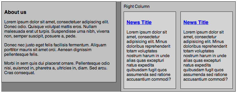
Nuestro HTML
<div class="row">
    <div class="span6">
        <h3>About us</h3>
        <p>Lorem ipsum dolor sit amet, consectetuer adipiscing.</p>
    </div>
    <div class="span6">
        <div class="row">
            <div class="span3">
                <h3><a href="#">News Title</a></h3>
                <p>Lorem ipsum dolor sit amet, consectetu elit.</p>
            </div>
            <div class="span3">
                <h3><a href="#">News Title</a></h3>
                <p>Lorem ipsum dolor sit amet, consectetu elit.</p>
            </div>
        </div>
    </div>
</div>
Problema...
.span6 {
	width: 49%;
}
.span3 {
	width: 23.5%;
} -
span6: 1000px * 0.49 = 490px
-
span3: 1000px * 0.235 = 235px
-
span3 dentro de span6: 490 * 0.235 = 115.15px
Responsive mixin
@mixin breakpoint($point) {
  @if ($point == phone-portrait) {
    @media only screen and (min-width: 480px) {
      @content;
    }
  } @if ($point == tablet) {
    @media only screen and (min-width: 768px) {
      @content;
    }
  } @else if ($point == desktop) {
    @media only screen and (min-width: 960px) {
      @content;
    }
  }
}
Variables
$cols: 12;
$gutter: 2%;
Columna
$one_col: (100% - ($gutter * ($cols - 1))) / $cols;$one_col: (100% - (2% * (12 - 1))) / 12;$one_col: 6.5%;
columnas de primer nivel
@mixin cols($num) { width: ($one_col * $num) + ($gutter * ($num - 1)); }@mixin cols(5) { width: (6.5% * 5) + (2% * (5% - 1)); }width: 40.5%;
columnas de segundo nivel
@mixin sub_cols($num_child, $num_parent) {$parent_size: ($one_col * $num_parent) + ($gutter * ($num_parent - 1));$child_size: ($one_col * $num_child) + ($gutter * ($num_child - 1));margin-left: ($gutter / $parent_size) * 100%; width: ($child_size / $parent_size) * 100%;}
columnas de segundo nivel
@mixin sub_cols(2, 4) {$parent_size: (6.5% * 4) + (2% * (4 - 1));$parent_size: 32%$child_size: (6.5% * 2) + (2% * (2 - 1));$child_size: 15%margin-left: (2% / 32%) * 100%;margin-left: 6.25%width: (15% / 32%) * 100%;width: 46.875%;}
Construyendo el grid
.row {// IE8 support #{enumerate('.span', 1, $cols, '')} { float: left; margin-left: $gutter; }[class^="span"], [class*="span"]{ float: left; margin-left: $gutter; }}
Construyendo el grid
.row {
  @for $i from 1 through $cols {
    .span#{$i} {
      @include cols($i);

      @for $j from 1 through ($i - 1) {
        .span#{$j} {
          @include sub_cols($j, $i);
        }
      }
    }
  }
}
Construyendo el grid
.row {
  > :first-child,
  .row > :first-child {
    margin-left: 0;
  }
}
CSS generado
.row .span4 .span3 {
  margin-left: 6.25%;
  width: 73.4375%;
}
.row .span5 {
  width: 40.5%;
}
.row .span5 .span1 {
  margin-left: 4.93827%;
  width: 16.04938%;
}
Responsive grids
para Compass
gem install susy
Crear un proyecto con Susy
compass create -r susy -u susy
Usarlo en un proyecto existente
# config.rb
require "susy"
Layout
variables basicas
// a 12-column grid $total-columns : 12;// each column is 4em wide $column-width : 4em;// 1em gutters between columns $gutter-width : 1em;// grid-padding equal to gutters $grid-padding : $gutter-width;
Otras variables
$container-style: magic | static | fluid. magic: grid tiene un width fijo, pero se vuelve fluido
para no 'desbordar' el viewport.
$container-width: <length>Sobreescribe el ancho total del grid con el valor que se pase.
Length: em, px, %, etc
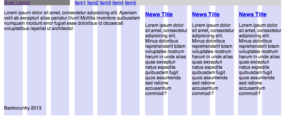
Nuestro HTML
<div class="container">
	<header>
		<a href="" class="logo">Susy Layout</a>
		<nav>
			<ul>
				<li><a href="#">Item1</a></li>
			</ul>
		</nav>
	</header>
	<div class="main">
		<p class="about">Lorem ipsum dolor sit amet.</p>
		<ul class="news">
			<li>
				<h3><a href="#">News Title</a></h3>
				<p>Lorem ipsum dolor sit amet, consectetur adipisicing elit.</p>
			</li>
		</ul>
	</div>
	<footer>
		<p>Backcountry 2013</p>
	</footer>
</div>
_base.scss
// Imports

@import "compass";
@import "normalize";
@import "susy";
_base.scss
// Basic Grid

$container-style: fluid;

$total-columns: 4;
$column-width: 4em;
$gutter-width: 1em;
$grid-padding: 1em;

// Alternative layouts
$tablet: 40em 8;
$computer: 60em 12;

$show-grid-backgrounds: true;
screen.scss
// Imports @import "base";// Layout .container { @include container; @include susy-grid-background; @include at-breakpoint($tablet) { @include container; @include susy-grid-background; } @include at-breakpoint($computer) { @include container; @include susy-grid-background; } }
screen.scss
.logo {
	display: block;
	background: gray;

	@include at-breakpoint($tablet) {
		@include span-columns(2);
	}
	@include at-breakpoint($computer) {
		@include span-columns(3);
	}
}
SCREEN.SCSS
nav {
	@include at-breakpoint($tablet) {
		@include span-columns(6 omega);
	}
	@include at-breakpoint($computer) {
		@include span-columns(9 omega);
	}
	ul {
		margin: 0;
		padding: 0;
	}
	li {
		@include inline-block;
	}
}
screen.scss
.about {
	@include at-breakpoint($tablet) {
		@include span-columns(2);
	}
	@include at-breakpoint($computer) {
		@include span-columns(6);
	}
}
screen.scss
.news {
	@include at-breakpoint($tablet) {
		@include span-columns(6 omega);

		li {
			@include span-columns(2, 6);

			&:last-child {
				@include omega;
			}
		}
	}
}
screen.css
.news {
	@include at-breakpoint($computer) {
		@include span-columns(6 omega);

		li {
			@include span-columns(2, 6);
		}
	}
}
Preguntas
Preguntas
¿Cuales son las partes de un grid?
Preguntas
¿Cuales son los 3 container styles de Susy?