RESPONSIVE
IMAGES
IN GRUNT
USE GRUNT TO CREATE YOUR
RESPONSIVE IMAGES
+ Simple, standard Grunt setup
+ Can be used with srcset or PictureFill
+ Easy to configure
+ Host images on your server
+ No need to rely on someone else's service
+ Open source
- Requires installation of Imagemagick CLI tools
Available ON NPM
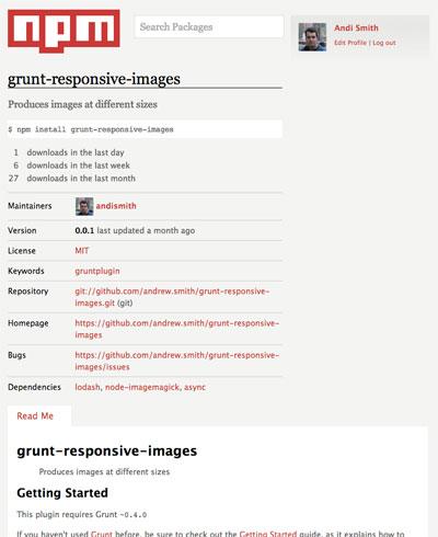
STEP 1: INSTALL GRUNT PLUGIN
-
Requires Grunt ~0.4.0
-
From your project directory in the command line:
npm install grunt-responsive-images --save - Add the load task to your Gruntfile:
grunt.loadNpmTasks('grunt-responsive-images');
STEP 2: INSTALL IMAGEMAGICK
-
Mac Homebrew Users:
brew install ImageMagick
-
Windows/Linux/Other Mac Users:
http://www.imagemagick.org/script/binary-releases.php
STEP 3: CONFIGURE!
A Default Configuration:
grunt.initConfig({
  responsive_images: {
    dev: {
      files: [{
        expand: true,
        src: ['assets/img/**/*.{jpg,gif,png}'],
        cwd: 'src/',
        dest: 'dist/'
      }]
    }
  },
})
Produces:
-
myImage-small.jpg
-
myImage-medium.jpg
-
myImage-large.jpg
STEP 3b: CONFIGURE MORE!
Options to configure:
- sizes - an array of objects
- sizes[].width - image width
- sizes[].height - image height
- sizes[].name - image size name
- sizes[].suffix - suffix for retina graphics
- sizes[].quality - image quality for JPGs
- separator - character used to separate the filename
If both width and height are specified, image is cropped
If name is not specified, width and/or height are used
EXAMPLE CONFIG
-
Configures two image sizes and retina for large.
grunt.initConfig({
  responsive_images: {
    dev: {
      options: {
        sizes: [{
          width: 320,
          height: 240
        },{
          name: 'large',
          width: 640
        },{
          name: "large",
          width: 1024,
          suffix: "_x2",
          quality: 0.6
        }]
      } ... });
MULTIPLE IMAGE CONFIGS
Different images, Different size configs?
- Setup multiple tasks
- Add different size options
- Use Grunt's file matching functionality to identify files.
DEMO TIME
Grunt Responsive Images
By Andi Smith